You graphics are representations that facilitate the analysis of data, which are usually arranged in tables when conducting research. Statistics. They bring much more practicality, especially when the data is not discrete, that is, when the numbers are considerably large. In addition, the graphs also clearly present the data in its temporal aspect.
Read too: What is the margin of error in a survey?
Chart elements
When building a graph in statistics, we must take into account some elements that are essential for its better understanding. A chart should be simple due to the need to pass information in a faster and more cohesive way, that is, in a statistical graph, there should not be much information, we should only put in it what is necessary.
The information in a chart must be arranged in a way clear and truthful so that the final results are given in a cohesive way with the research purpose.
Types of graphics
In statistics it is very common to use diagrams to represent data, diagramsare graphics built in two dimensions
, that is, on the plane. There are several ways to represent them, the main ones are: dot chart, line chart, bar chart, column chart and pie chart.read more: Mode, Average, and Median: Numbers that summarize information from data lists
dot chart
Also known as Dotplot, is used when we have a frequency distribution table, being it absolute or relative. The point chart is intended to present the table data in a summarized form and that allows the analysis of the distributions of these data.
Example
Suppose a survey, carried out in a kindergarten school, in which the ages of children were collected. In this collection, the following list was organized:
Role: {1, 1, 2, 2, 2, 2, 3, 3, 4, 4, 4, 4, 4, 4, 5, 5, 6}
We can organize this data using a Dotplot

Note that the amount of points corresponds to the frequency of each age and the sum of all points gives us the total amount of data collected.
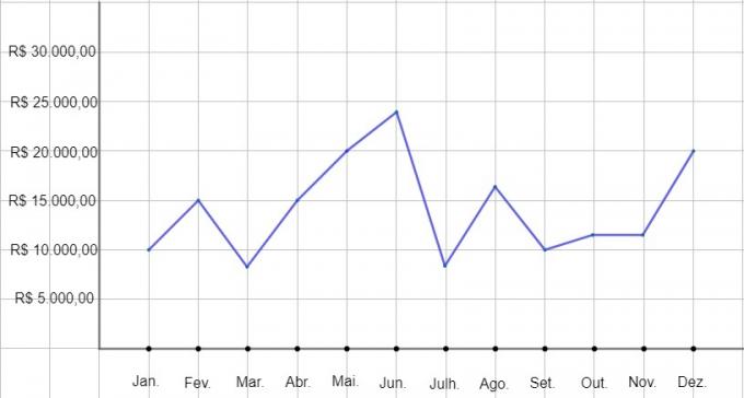
line graph
It is used in cases where there is a need to analyze data over time, this type of chart is very present in financial analyses. The abscissa axis (x axis) represents time, which can be given in years, months, days, hours, etc., while the ordinate axis (y axis) represents the other data in question.
One of the advantages of this type of chart is the possibility of analyzing more than one table, for example.
Do not stop now... There's more after the advertising ;)
Example
A company wants to check its sales in a given year, the data were arranged in a table:
Month |
Revenues |
Month |
Revenues |
January |
BRL 10,000.00 |
0 |
BRL 8,000.00 |
February |
BRL 15,000.00 |
0 |
BRL 16,000.00 |
March |
BRL 8,000.00 |
0 |
BRL 10,000.00 |
April |
BRL 15,000.00 |
0 |
BRL 11,000.00 |
May |
BRL 20,000.00 |
0 |
BRL 11,000.00 |
June |
BRL 24,000.00 |
0 |
BRL 20,000.00 |

See that in this type of graph it is possible to have a better idea about the growth or decrease of the company's earnings.
bar chart
Aims compare data from a given sample using rectangles of the same width and height. This height must be proportional to the data involved, that is, the greater the frequency of the data, the greater the height of the rectangle.
Example
Imagine that a given survey aims to analyze the percentage of a given population that accesses or has: internet, electricity, cellular network, mobile device or tablet. The results of this survey can be arranged in a graph like this:

Column chart
Its style is similar to that of the bar chart and is used for the same purpose. The column chart is then used when subtitles are short, in order not to leave too many white spaces in the bar graph.
Example
This chart is, in a generic way, quantifying and comparing a certain quantity over a few years.

sector chart
It is used to represent statistical data with a circle divided into sectors, the areas of the sectors are proportional to the frequencies of the data, that is, the higher the frequency, the greater the area of the circular sector.
Example
This example, in a generic way, is presenting different variables with different frequencies for certain quantity, which can be, for example, the percentage of votes for candidates in a election.
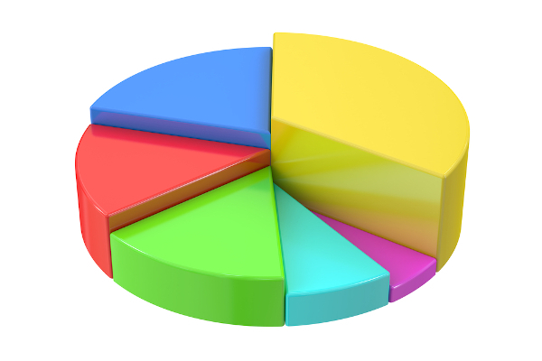
Read too: Circular sector area: how to calculate
solved exercises
question 1 – (Fuvest - 1999) The age distribution of students in a class is given by the following graph:
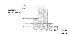
Which alternative best represents the average age of students?
a) 16 years and 10 months
b) 17 years and 1 month
c) 17 years and 5 months
d) 18 years and 6 months
e) 19 years and 2 months
Solution
Alternative c.
Note that the x-axis of the graph gives us the age of the students and the y-axis gives us the frequency of each age, that is, the number of times the age appears. Thus, we must use the weighted average to calculate the average of the ages.
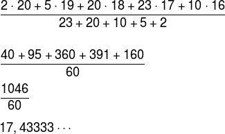
We know that 17.43333… = 17 + 0.4333…. To transform 0.43333… in months we must multiply it by 12, then:
0.4333 · 12 = 5 months
Therefore, the average age of these students is 17 years and 5 months.
by Robson Luiz
Maths teacher