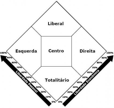
Nolan's diagram is a graphic model created by the American political scientist David Nolan in 1969. The schema is meant to be used as a test to help identify the political vision predominant of the respondent. The diagram was created according to the most popular currents of political thought.

Nolan's diagram was created by the scientist because he believed that political positions are diverse and should not be limited between the concepts of right and left.
The original diagram, also known as the Nolan Graph, has two central axes: economic freedom and individual freedom. The graph is also divided into five policy trends: right, left, center, liberal and totalitarian.
Learn about the meanings of Right and Left.
Over time, several variations of the test were created. But all versions have in common the preparation of the questionnaire based on questions that refer to economic preferences and coexistence in society. Questions are asked to define which political spectrum most answers fall.
By analyzing the answers given, these can be the results of the Nolan Diagram test:
- Right (preference for the defense of economic non-intervention and some restrictions on moral issues);
- Left (preference for the defense of intervention in the economy and non-intervention in moral issues);
- Liberal (tendency to support total freedom in economics and moral issues);
- statist (tendency to support measures of restraint in economy and morale);
- center (balanced positioning between restrictions and freedoms).
See also the meaning of Politics and Diagram.
