Diagram is a graphical representation used to demonstrate a simplified scheme or a summary about a subject.
It is usually formed by keywords or concepts that are linked by lines and arrows that define the reasoning to be followed so that it is possible to understand the topic.
The word originates from the Latin term diagramma.atis. They can be synonyms: graphic, drawing, scheme, figure and sketch.
Diagrams are often used as a study tool, as it is known that the assimilation of content happens more easily through schematics and graphical representations. It can also be used to demonstrate the organizational flow of a company.
Diagram is the name given to the scheme used as the basis for organizing scenes in film footage or television programs.
To diagram, used as a verb, has the meaning of organizing and distributing the graphics used in a publication, such as newspapers, books, posters and websites.
Ishikawa diagram
This diagram, also called the Cause and Effect Diagram, Fishbone Diagram, or 6M Diagram, was created by Kaoru Ishikawa.
The main use is to be a tool to improve quality control through the identification of the most important aspects of a problem to solve it and to prevent it from coming back to happen.
The Ishikawa Diagram is used by companies and working groups to carry out assessments and to control the quality of their administrative processes and their functioning.
The diagram helps to identify possible causes of problems that can be classified into six types different, called 6M: work method, raw material, labor, machines, measurement and environment environment.
How to use the Ishikawa Diagram
To use the diagram, you need to define the problem to be solved and gather information about it. The work team involved in the area must meet and use the information collected to assemble the 6M Diagram.
The diagram should contain: a title, the problem to be analyzed, a central axis that points to the intended solution, the influencing factors and the possible causes that are linked to the problem.

See the meaning of Ishikawa diagram.
Pareto Diagram
It is a chart, created by economist Vilfredo Pareto, used to find and order the main occurrences of losses or problems in a company.
The diagram is based on the 80/20 Pareto Principle. According to this principle 80% of the results obtained are caused by only 20% of causes. This means that few problems can result in considerable loss for a company, while many small problems may not have as many loss consequences.
How to use Pareto Diagram
The first step is to identify the problem or loss you want to investigate and resolve. Then it is necessary to organize a table in which the data related to the chosen problem are placed, with the number of records of its occurrence. For example: problem 1 happened 15 times, problem 2 happened 12 times, and so on.
After recording these data, it is necessary to choose which aspects of the problem will be analyzed. This data should also be organized by number of occurrences, in order from highest to lowest occurrence.
After all numbers have been entered, calculate how often each situation occurs. It is this data that should be used to build the diagram.

See more about the meaning of Pareto diagram.
Venn diagram
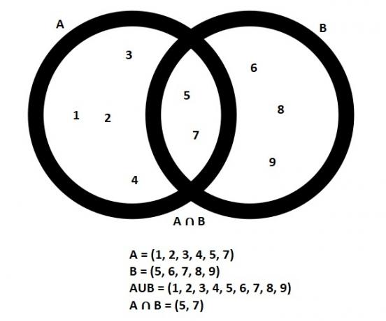
The Venn Diagram, also called the Set Diagram or Logic Diagram, was created by mathematician John Venn and is widely used in mathematics and statistics.
It is a form of organization that uses numerical sets in which data is grouped using geometric figures, mainly circles that connect sets of numbers or information.
This form of organization with geometric figures facilitates the visualization and interpretation of data.
The Venn Diagram helps you to easily see which data is present in a single situation and which data is part of more than one situation at the same time.
It is also easy to visualize which is the union (U) of the data and which is the intersection (∩), that is, which data is common to all sets. See the example:

See also the meaning of Venn diagram.
Nolan's diagram
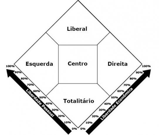
This diagram, created by political scientist David Nolan, is intended to help identify what is the predominant political vision in a person's thinking.
Nolan developed the diagram taking into account the most popular currents of political thought. He established the division into five trends: right, left, liberal, totalitarian and center.
To use the diagram, you have to answer a questionnaire, which nowadays has different versions. From the answers given to the questionnaire, it is possible to know with which current of political thought there is more identification.
According to Nolan the possible outcomes are as follows:
- right tendency (prefers that there is no intervention in the economy and accepts some moral restrictions);
- left tendency (prefers intervention in the economy and disagrees with intervention in moral values);
- to the center (position of greater balance between imposed freedoms and restrictions);
- liberal tendency (identification with freedom in economics and moral issues);
- statist tendency (supports some restrictions on economic and moral issues).

Find out more details about the Nolan's diagram.
Linus Pauling diagram
This diagram, created by scientist Linus Pauling, is also known as the Electronic Distribution Diagram or Aufbau Principle.
It is used in chemistry for research related to atoms. This method of study helps to understand the properties and characteristics of atoms, their electrons and ions, based on their energy sub-levels.
The diagram is considered to be one of the best explanations of how ions and electrons are distributed throughout the layers of atoms. With it, it is possible to know, for example, how many layers are filled by each of the elements of an atom.
Linus Pauling created the diagram from the order of distribution of chemical elements in the periodic table, which are arranged by the number of atoms, from smallest number to largest. For this he considered the seven layers of atoms, which are represented by the letters K, L, M, N, O, P, Q. See below:

See more details about the Linus Pauling diagram.
Class Diagram
The Class Diagram is used in computer programming and in this diagram the structure and class relationships of a project are represented. It is a fundamental part of the Unified Modeling Language (UML) or Unfied Modeling Language, in English.
The basic function of the diagram is to demonstrate what the UML's goals are and to organize all the coding of systems development.
The Diagram must contain all the classes that are necessary for the system to work, which are the characteristics and attributes necessary for the project.
How the Class Diagram is formed
In addition to the classes, the attribute, association and operation are part of the diagram. Attributes are the characteristics of classes, which can be name and visibility (public or private), for example.
Association is linked to the relationship between classes and the way information arrives and leaves the system. The operation, which also contains the visibility and the name, refers to a function of an abstract object.

see the Class Diagram.
Scatter diagram
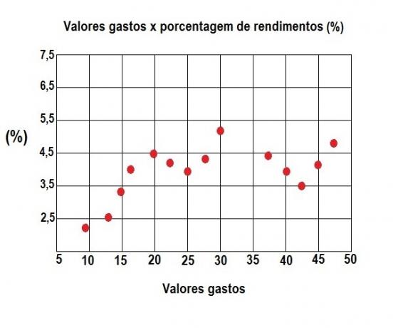
This diagram is used to demonstrate the values of a dataset and to confirm the relationship between them.
It is also called a correlation diagram because placing the data on the chart makes it easy to see the relationship that exists between values or elements.
The obtained values are displayed in a graph with coordinates arranged on a horizontal axis and a vertical axis. Afterwards, the points where the data are connected are marked.
The diagram is used as a quality tool to assess the influence or cause-and-effect relationships between elements.
For example: the relationship between expenses and income, between quality of life and life expectancy indexes, and the relationship between expected weight/height for an age.

Other diagrams
O Phases diagram is used to define what values the relationship exists between the pressure and temperature conditions of a substance and the phase in which it is found (solid, liquid or gaseous). An example is the Iron Carbon Diagram.
O Activity Diagram represents processing flows for activity control. This diagram is used to follow the phases of a computational process. The Activity Diagram is made using the Unified Modeling Language (UML).
See also about visual communication.
