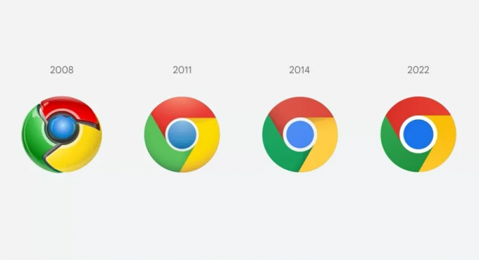
Google is a company that is certainly interested in maintaining its visual identity, because whenever it can, it avoids too sudden changes. And that's what happened recently, with the first change in google chrome icon in eight years.
However, the change that was announced on Twitter by Elvin Hu, one of Chrome's designers, went unnoticed by many people. Including, in Elvin's post, the designer himself jokes with the fact that there was a change, but no one noticed.
see more
How to get your CNH for free in 2023?
After hacker attacks, Microsoft releases free tools for…
Read more: Gmail's new look is coming soon: See what will change on the platform.
Who can see the new Google Chrome icon?
In the announcement, Elvin points out that the change is now available to view, however, only for Chrome Canary users. This is a platform where Google developers track and announce news. Anyone interested in learning about Google's experimental details can head over to Chrome Canary. Thus, these users end up being those who approve or disapprove platform updates.

What really changed about the icon?
If you were also one of those who could not identify that there were changes to the Google Chrome icon, the designer explains. According to Elvin, the icon has been simplified and refined, so that shadows have been removed and proportions have been adjusted.
Furthermore, the designer also reported that an extra glow has been added to the icon's colors, which in turn remain the same. Another change that would happen would be the white lines that make the separation between the colors, which would be thicker.
However, this change was not approved by all designers, as it would introduce more negative space to the icon. Also, the icon size would be small, making it more difficult to recognize. Anyway, the first change since 2014 ended up being noticed and talked about, but we hope it won't take another eight for a new change.


