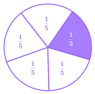
A pie chart, also known as a pie or pie chart, is a representation of data from different categories in the form of slices or pie charts.
It is a statistical tool used to analyze and express a comparison between the amounts of data obtained for different categories in a survey or count.
The slices or sectors occupy different areas, according to the proportion between the amounts of data in each category. This proportion is represented as a percentage, where sectors with a higher percentage appear with larger areas.
How to make a pie chart
A chart can be drawn on paper or with the help of spreadsheets. The process of building the chart is divided into three steps:
1st: obtain the data (total and for each category or sector);
2nd: transform the quantities into percentages;
3rd: represent graphically.
Step 1: Obtaining the data.
In any case, it is necessary to obtain the data or the quantity of each category and the total quantity. These data are obtained by a statistical search or counting of elements.
Step 2: Convert the amounts into percentages.
To transform the values of each category into percentages, we use a rule of three.
Cross-multiplying and isolating x, we have:
Where x is the percentage of each sector.
Step 3: represent the percentages graphically.
We need to know the relationship between percentage and the angle that forms the sector.
The entire circle represents 100% and as its central angle is 360º (degrees), dividing it we find that:
3.6º are equivalent to 1% of the total data obtained.
Thus, to know the angle of the sector, just multiply 3.6º by its respective percentage.
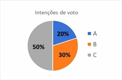
Pie chart example
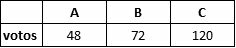
To build the graph, we start with step 1, where we already have the data from a survey carried out with 240 voters where the voting intentions for candidates A, B and C were obtained.
Of the 240 voters who responded to the survey:
A got 48 votes.
B got 72 votes.
C got 120 votes.
For step 2, we must transform the quantities for each candidate into percentages.
Candidate A
Candidate B
Candidate C
In step 3, we need to determine the formation angle of each sector and, as we already know that for each 1% we must use 3.6º, for each sector we will have:
Sector A
20 x 3.6º = 72º
Sector B
30 x 3.6º = 108º
Sector B
50 x 3.6º = 180º
To better organize the data, we arrange it in a table:
| THE | B | Ç | total | |
| wishes | 48 | 72 | 120 | 240 |
| percentage | 20% | 30% | 50% | 100% |
| sector angle | 72º | 108º | 180º | 360º |
Drawing the pie chart on paper
To draw the graph you need: paper, pen, colored pencils, compass, protractor and ruler.
- Use the compass to draw a circle on paper.
- With the protractor mark the openings of the angles and close the sectors with the help of the ruler.
- Paint the sectors with different colors, write the percentages and the names of each sector.
- If necessary, make a legend with the colors and the names of the sectors.
Creating the Pie Chart with a Spreadsheet
There are many free spreadsheet programs and applications for PC and cell phones that create charts. Each program or application will have its particularities such as the location of buttons and settings. In general, we should follow these steps:
1. To create a chart in a spreadsheet, first make the table with the quantities of each sector.
It is not necessary to calculate the percentages and angles of the sectors, as the program itself calculates automatically.
2. Click on insert charts and choose the chart type, in this case, pie charts.
3. Select the data in the worksheet.
4. Edit the chart to your preference.
To learn more, see all about graphics.