You types of graphics include the different ways to represent some information and data, the most important being: column, row, pie and area.
Understanding graphics today is an essential task, as they are very present in our daily lives, whether in newspapers, magazines, internet, etc.
In addition, the contests, entrance exams and Enem, contain several issues in which the graphics are present. So, nothing is more important than knowing your types and knowing how to interpret them.
What are Graphics?
Graphs are visual representations used to display data, whether about certain information, or numerical values.
Generally, they are used to demonstrate patterns, trends and also compare qualitative and quantitative information in a given period of time.
They are tools used in various fields of study (mathematics, statistics, geography, economics, history, etc.) to make some data easier to see, as well as to make the data clearer and informative.
Thus, the use of graphics makes interpretation and/or analysis faster and more objective.
Graphics Elements
Some important elements that are included in the graphics are:
- Title: usually have a title regarding the information that will be presented.
- Source: many graphics, especially those in the statistics area, show the source, that is, where the information was taken. They can also present the year of publication of the referred source.
- Numbers: these are essential for comparing the information given by the graphics. Most of them use numbers, either to indicate quantity or time (month, year, quarter).
- Subtitles: most of the graphics have captions that help in reading the information presented. Next to it, colors that highlight different information, data or periods are used.
Graphics Classification
Now let's look at the different ways to display data in a graph, according to the intended purpose:
Column Chart
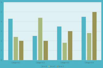
Also known as “Bar Graph”, they are used to compare quantities or even demonstrate specific values for a certain period. Columns can appear in two ways:
Horizontal:
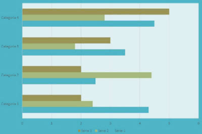
Vertical:
Line Charts
Also called “Segment Graph”, it is used to present values (number sequence) in a given time frame. In other words, it shows the evolution or reduction of some phenomenon.

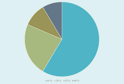
Pizza graphic
Also called “Sector Chart”, this model receives this name because it has the shape of a pizza, that is, it is circular. They are used to gather values from a whole, according to the concept of proportionality.
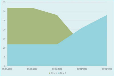
Area Chart
This type of chart is used to show changes or compare values over time. It is formed by a set of lines and points where the area is filled.
Histogram
The Histogram is a data analysis tool that presents several juxtaposed rectangles (vertical bars).
For this reason, it resembles the column chart, however, the histogram has no space between the bars.
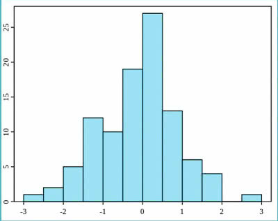
It is widely used in the area of statistic, being an important indicator for data distribution.
According to their graphical representation, they are classified into:
- Symmetrical Histograms: composed of a higher frequency (in the center) that gradually decreases as it approaches the edges.
- Asymmetric Histograms: has only one highest point, the rest of the rectangles are asymmetrical.
- Cliff Histogram: In this type, the representation looks incomplete as it is used when some data is deleted.
- Histogram with Two Peaks: in this case, we have two distinct data analyzes that have two peaks (larger points).
- Plateau histogram: in the center of the figure you can see the approximation of frequencies, which forms a less uneven figure.
- Histogram Isolated Rectangles: also called “isolated island”, this case of histogram has gaps, which in turn indicate an abnormality or errors in the process.
Infographics
Infographics represent the union of an image with an informative text. Images may contain some types of graphics.
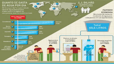
Infographic on Water Consumption
Like graphics, they make it easier to understand a topic. This type of tool is widely used in the journalistic environment and also in textbooks.
Diagrams
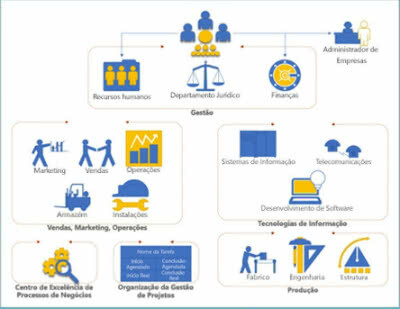
Diagram Example
Diagrams are types of graphical representations, which show, for example, a scheme or a mockup.
They are also used to simplify an idea or concept, and therefore facilitate the interpretation of the topic.
Usually include lines, arrows, drawings, etc. They are widely used in the field of statistics and administration.
Tables
Tables are used to organize some information or data. Like graphs, they make it easier to understand through the lines and columns that separate the data.

Therefore, they are used for better visualization of information in various areas of knowledge. They are also very frequent in competitions and entrance exams.
Enem Exercises with Feedback
Check below exercises with graphs that fell on Enem:
1. (Enem-2012) The owner of a pharmacy decided to make the following chart available to the public, which shows the evolution of total sales (in Reais) of a certain drug throughout 2011.
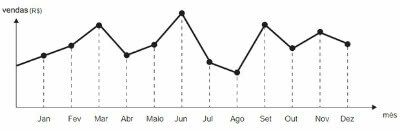
According to the graph, the months in which the highest and lowest absolute sales in 2011 occurred, respectively, were
a) March and April.
b) March and August.
c) August and September.
d) June and September.
e) June and August.
Alternative and
2. (Enem-2012) The following figure presents two graphs with information about the daily complaints received and resolved by the Customer Service Sector (SAC) of a company, in a given week. The dashed line graph informs the number of complaints received in the day, the solid line is the number of complaints resolved that day. Complaints can be resolved on the same day or take longer than one day to resolve.
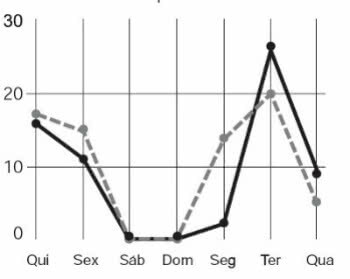
The service manager wants to identify the days of the week when the efficiency level can be considered very good, that is, the days when the number of complaints resolved exceeds the number of complaints received.
Available in: http://blog.bibliotecaunix.org. Accessed on: 21 Jan. 2012 (adapted).
The service manager was able to conclude, based on the concept of efficiency used in the company and on the information in the chart, that the level of efficiency was very good in:
a) Monday and Tuesday.
b) Tuesday and Wednesday.
c) Tuesday and Thursday.
d) Thursday, Saturday and Sunday.
e) Monday, Thursday and Friday.
Alternative b
3. (Enem-2005) Text for questions 1 and 2:
In recent years, there has been a gradual reduction in the rate of population growth on almost all continents. Below, data for the most populous countries in 2000 and projections for 2050 are presented.
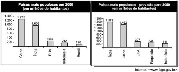
(Question 1) Based on the above information, it is correct to state that, in the period from 2000 to 2050:
a) China's population growth rate will be negative.
b) the population of Brazil had doubled.
c) Indonesia's population growth rate will be lower than that of the US.
d) Pakistan's population will grow by more than 100%.
e) China will be the country with the highest population growth rate in the world.
Alternative
4. (Question 2) Based on the information in the graphs shown, suppose that, in the period 2050-2100, India's population growth rate is the same projected for the period 2000-2050. Thus, at the beginning of the 22nd century, India's population, in billions of people, will be:
a) less than 2.0
b) greater than 2.0 and less than 2.1
c) greater than 2.1 and less than 2.2
d) greater than 2.2 and less than 2.3
e) greater than 2.3
Alternative and