
age pyramids they are population indicators that, through graphics, allow the analysis of population dynamics in a given location according to age and sex.
Summary
The study of population dynamics requires a structural analysis. One of the most used resources for this analysis are the age pyramids. These are graphical representations that organize the population of a given place according to age groups, dividing them by sex. There are four main types of age pyramids: young pyramid, adult pyramid, rejuvenated pyramid and aged pyramid.
The importance of age pyramids as a social indicator
The use of age pyramids as a social indicator allows the study of the organization of certain societies. This study can be carried out over the years and allows for the analysis of social dynamics in a given spatial frame. It is also useful in the elaboration of public policies aimed at the social and economic development of a society. Pyramids therefore reflect demographic evolution, demonstrating the expansion, decline or stability of a population.
To better understand how age pyramids are able to reflect demographic evolution, take a look at the following analysis:
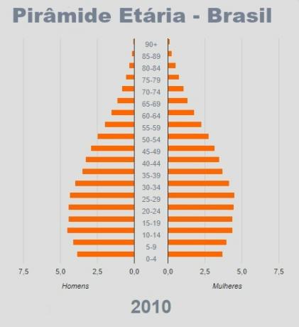

Source: Brazilian Institute of Geography and Statistics – Adapted
By observing the two age pyramids, we can analyze the evolution of the Brazilian population in a spatial cut between the year 2010 and a projection for the year 2060. The 2010 pyramid indicates a high birth rate as its base is wide. In the projection for 2060, the scenario changes: the base narrows, indicating a reduction in the number of births.
It is also possible to notice that the young and adult population (economically active population) is greater in 2010, narrowing down to the 2060 projection. This is due to the fact that, in the future, the trend will be to increasingly reduce the birth rate and, consequently, reduce the economically active population.
A dramatic shift also takes place at the top of the pyramids. In 2010, the number of elderly people in Brazil is very small, which makes it possible to say that life expectancy was low, therefore, access to health was precarious and there was a poor quality of life. In the projection for the year 2060, the top would languish, demonstrating an increase in the life expectancy of Brazilians and indicating improved health, access to medicines and better lifestyle habits.
Another analysis that can be done is that women live longer in Brazil regardless of the year, since, culturally, women take more care of their health and are less involved in conflict situations that generate Deaths.
Analysis of age pyramids
Age pyramids are graphical representations of the population structure of a place divided by age group and sex. Graphs consist of superimposed bars and have top, body and base. The lower bars correspond to the youngest population, and the upper bars correspond to the oldest population. The left side of the graph represents the male population, while the right side represents the female population.
See below how to analyze an age pyramid according to its parts:

Source: IBGE – 2018
Top:represents the elderly population.
Body: represents the adult population.
Base: represents the young population.
horizontal axis: corresponds to the number of people (in absolute value or as a percentage). On the right are the women. On the left are the men.
vertical axis: corresponds to age ranges.
Age pyramids of developed countries
Developed countries such as Japan, France and Sweden generally have high life expectancy. This is because the population has better living conditions in relation to health and education, for example. In these countries, birth and death rates are low, which suggests low vegetative growth (difference between birth rate and death rate).
The pyramids in these countries usually have narrow bases, that is, the number of young people is smaller. Its top is wide, which indicates a greater proportion of the number of elderly people. This allows us to analyze that, in these countries, there are problems such as lack of labor and spending on welfare programs for the aging population.
Know more: Countries with high human development rates
Age pyramids of underdeveloped countries
Underdeveloped countries are generally located in Latin America, Asia and Oceania. As a result of the situations experienced by most of their population, these countries have low life expectancy. In underdeveloped countries, birth and death rates are high, suggesting a high vegetative growth.
The age pyramids of underdeveloped countries commonly have broad bases, indicating a large number of young people. Its top is narrow, which represents a lower percentage of elderly people. This allows us to analyze that, in these countries, there are problems related to public policies. In addition, the population needs a better quality of life, investments in health and education, professional training and insertion in the labor market.
Read more: Countries with low human development indices

There are four main types of age pyramids with specific characteristics that reflect a particular dynamics of the population under analysis.
Types of age pyramids
There are four main types of age pyramids, reflecting the structure of different societies:
1. young pyramid: presents a broad base, indicating that the birth rate is high, consequently, the population represented is young. The top is narrow, so the aging population does not have high life expectancy. A high number of young people indicate large families and few resources to meet the population's basic needs. Underdeveloped countries generally have this type of pyramid. In these countries, public policies are insufficient, and access to education and health is precarious.
2. adult pyramida: presents a broad base with a tendency to decrease, as there is a tendency for a reduction in the birth rate. The top and the body of the pyramid appear wider, noting the increase in life expectancy, and the body represents the economically active population. Developing countries usually have this type of pyramid. In these countries, there is an improvement in access to basic conditions, such as health, education and qualified training for the labor market.
3. aged pyramid: presents a narrower base, representing a reduction in fertility and birth rates. Its top is wider compared to the tops of the other pyramids, indicating a reduction in mortality rates and an increase in life expectancy. The aged pyramid thus demonstrates that the countries it represents face problems due to the small proportion of the economically active population and the increase in the elderly population. The high number of elderly people demands spending on the part of assistance programs, as this age group is outside the labor market.
4. rejuvenated pyramid: presents widening in the first bands of the base, indicating an increase in the number of young people. It also has a wider top, indicating better life expectancy and quality of life. Developed countries started to present this type of pyramid as a result of the need to increase the workforce. Thus, in these countries, an increase in the birth rate is encouraged and an attempt is made to maintain a high life expectancy.
Brazilian age pyramid
The Brazilian age pyramid has evolved over the years. The country went through intense industrialization and urbanization processes, which changed the population dynamics. Advances in medicine caused a drop in birth rates, as the population began to have greater access to medicines and contraceptive methods. Proportionally, then, there was a reduction in the base of the pyramid.
Urbanization changed the way of life of families, and some of them started to see children as an increase in expenses. In addition, with their insertion in the labor market, women began to marry later and choose to have children at an older age or not.
The improvement in quality of life was also significant, increasing life expectancy as a result of advances in public health policies and greater access to education over the years. Thus, there was an enlargement of the top of the Brazilian age pyramid.
Next, we will analyze the age pyramid of Brazil in the year 1940 and the population projection for the year 2040. Through this analysis, it will be possible to perceive the issues presented above.

Source: IBGE – Demographic Census – 1940
The broad base of the 1940 pyramid indicates a high birth rate and low quality of life, as the pyramid narrows with increasing age. Life expectancy is also low, as shown by the extremely low top.

Source: IBGE – Demographic Projection – 2040
Note that, in addition to the significant population increase from 1940 to the 2040 projection, there is a significant change in the shape of the pyramid. Despite the growing population increase, there will be downward trends in birth rates. There will also be an evolution of the economically active population, indicating an improvement in professional training, quality of life and a reduction in mortality. The wide top indicates that there will be an increase in the expectation of the elderly population, expressing an improvement in health care, disease containment and advances in the field of medicine.
Read too:Brazilians' life expectancy
Age pyramid exercises
Question 1 – (CEFET-MG) Analyze the following charts:

Image source: IBGE
From reading the data, it is correct to infer that, in the period analyzed, there was
a) constant reduction in birth rates.
b) increase in life expectancy.
c) growth in infant mortality.
d) expansion of vegetative growth.
e) minimization of social security demand.
Resolution: Alternative B.
It is possible to observe that there was a considerable increase in the population's life expectancy between the years 1980 and 2050, indicating an improvement in the quality of life and advances in health.
Question 2 – (UPE) Analyze the following chart:

Image source: IBGE
Considering the indicators shown in the graph and the current changes in the aging process of the Brazilian population, it is CORRECT to state that
a) life expectancy in Brazil has been increasing very rapidly, consequently, presenting rates of longevity above those of countries with a high human development index in aspects such as health, schooling and nutrition.
b) according to demographic indicators, Brazil is at the beginning of the transition stage from a young country to a mature country. The percentage of elderly people is similar to that of countries like Sweden, Italy and Sierra Leone.
c) despite the changes that occurred in the age structure of the Brazilian population, between the 1960s and 2010, the country continues demographically young, with high birth and mortality rates and a low life expectancy for the population in general.
d) the fertility rate in Brazil has been declining, and the proportion of elderly people has been growing faster than the proportion of children. However, this population aging process does not occur uniformly in all Brazilian regions.
e) the aging of the Brazilian population comes from the intense urbanization process in all its regions. Therefore, the triangular aspect of the age pyramid has shown, in recent decades, a percentage increase in the demographic bonus of men and women.
Resolution: Alternative D
It cannot be said that Brazil has longevity rates above the rates presented by countries developed, since the elderly population in Brazil has not yet surpassed the growth of this population in these countries. Brazil has shown a decrease in birth and mortality rates, indicating an improvement in the quality of life and an increase in life expectancy. Aging, therefore, is not related to urbanization, but to advances in medicine and an improvement in quality of life. In addition, fertility rates, according to the pyramid, indicate a decrease, as there is a narrowing of the base. The widening of the top indicates an increase in the elderly population.
By Rafaela Sousa
Graduated in Geography
Source: Brazil School - https://brasilescola.uol.com.br/geografia/piramides-etarias.htm